The associated New York Times opinion piece (“Statistics Indicate an Ivy League Asian Quota“, penned by uber-conservative anti-affirmative action lobbyist Ron Unz) makes the same argument more explicitly.
To Unz’s credit, this infographic is superficially compelling. I’ve been writing in detail about affirmative action for the last year or more, and even I never really questioned these data. I just sort of accepted this graph, if not its larger conclusions.
That is, until today, when I sat down and asked myself whether or not Unz’s assertions really made sense mathematically? And y’know what, guys — turns out that everything we thought we knew about this infographic is wrong!
It turns out that this infographic is classic “truthiness“.
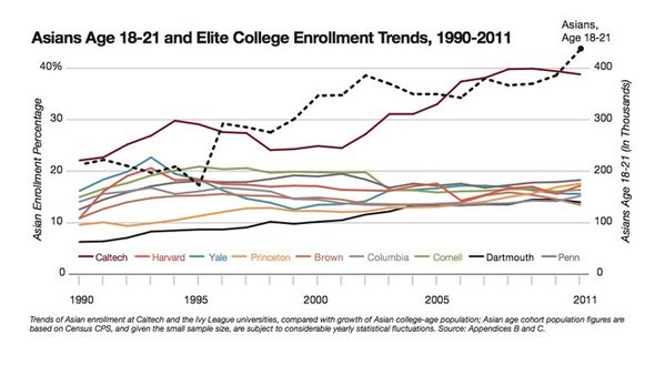
Our first sign that there’s something suspicious about Unz’s infographic is its use of dual y-axes to superimpose two completely different sets of datapoints: Asian enrollment at several schools vs. college-aged Asian American population numbers. While there’s nothing innately wrong with doing this, it’s certainly a way of massaging data to make it appear to support your conclusion. It’s all in the scaling: Unz has chosen to scale both x-axes in such a way as to make the two datasets appear to mirror one another; yet, one could change the scaling to make it appear differently. Again, this doesn’t necessarily invalidate the infographic, but it’s a tip-off that Unz is savvy of how to make presentation choices for the data to add subconscious support to his tale.
The better question, however, is whether or not we believe Unz’s underlying message: that Ivy League schools aren’t keeping pace in their Asian American enrollment with increases in Asian American population growth. Unz seems like he might be correct: after all, Asian Americans are the fastest growing racial or ethnic group in America. It seems only intuitive that we should see massive increases in Harvard’s Asian American student population size too, right?
Actually, not necessarily.
Setting aside Unz’s infographic for a second, we can actually figure this out for a school like Harvard (a good model school since it is the target of the latest anti-affirmative action lawsuit citing an anti-Asian American cap quota). While detailed application demographics are not available for private institutions like Harvard (as they are available for UC school systems), enough information is available to make a rough calculation regarding this question.
And that’s exactly what I did.
I chose to start with the year 2000 and compare it to 2014’s enrollment data for Harvard, and to ask if the changes in Asian American enrollment paced with overall changes in Harvard’s estimated Asian American applicant pool. There are a few reasons to choose these two years: 1) US Census data for the year 2000 are readily available, 2) Harvard’s data for this year are also readily available, 3) Caltech’s rising Asian American enrollment only occurs after the year 2000, and 4) going much further back into the past beyond 2003 extends us into affirmative action policies that have not been influenced by Supreme Court rulings of the landmark Gratz and Bollinger cases, and so is no longer as applicable to contemporary interpretations of affirmative action law and policy.
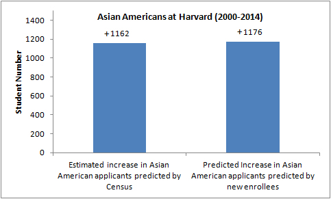
In 2000, Harvard received 18,190 applications. In 2000, Asian Americans made up 3.6% of the country’s population. If we use this percentage to estimate the number of Asian American applicants to Harvard, we arrive at 655 Asian American applicants.
Last year, Harvard received 34,295 applications. Currently, Asian Americans make up 5.3% of the country’s population. Using the same process of estimation, we arrive at 1,817 Asian American applicants.
Sure, the distribution of college-aged Asian Americans might be different than our national distribution, but what’s important here is the relative increase in Asian American applications to Harvard in the last fourteen years. Our calculations estimate that Harvard is now receiving an additional ~1,162 Asian American applications every year compared to 2000, representing a ~50% increase in the Asian American population in that time.
Okay, so now we have to ask ourselves whether or not Asian American enrollment to Harvard has actually remained flat between 2000 and 2014. In 2000, 16.4% of Harvard’s incoming freshmen were Asian American (which, by the way, doesn’t reflect the apparent datapoint for the year 2000 included in Unz’s graph). Last year, 20% of Harvard’s incoming class was Asian American. When we translate this into absolute numbers based on class size for 2000 (1,985 students) vs. 2014 (2,048), we arrive at 325 Asian American students admitted in 2000 compared to 409 Asian American students admitted in 2014. That’s an increase of 84 Asian American students.
That doesn’t seem like much, except that we have to remember that Harvard is a highly selective college with a relatively tiny incoming freshman class admitted from a large (and expanding) applicant pool. So, each student in a freshman class of about 2000 students represents approximately 14 applicants (2000 admitted x 14 = 28,000 applicants, which represents a ballparked average of the number of applicants to Harvard spanning the years from 2000 vs 2014).
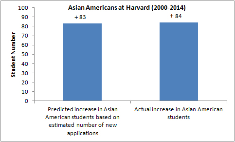
As calculated, 84 new Asian American students were admitted to Harvard between 2000 and 2014. So, this increase in admitted Asian American students represents an approximate (84×14) 1,176 additional Asian American applicants to Harvard. Remember how we calculated that Harvard received an approximate 1,162 new Asian American applications in that time?
Yeah, it turns out that increases in Harvard’s enrollment of Asian American students between 2000 – 2014 appears to have largely kept pace with the overall growth in the Asian American population in that time.
Put another way, our population growth results in 1,162 new Asian American applications to Harvard. That translates to a predicted (1162/14) increase to 83 new Asian American students per year in order to keep pace. Between 2000-2014, the actual reported increase of Asian American freshmen to Harvard was an additional 84 students per year.
Now, you might argue that national population distribution is not a meaningful proxy for changes in the Asian American college-aged population, and I would agree with you. Except, that Unz’s own infographic suggests that between 2000-2014, the Asian American college-aged population increased by about 50%, which is similar to the percent change used in my calculations. Second, and more importantly in my mind, I am using the same national population distribution numbers that opponents of affirmative action typically use to estimate changes in Asian American application to elite universities. In short, this approach of using national numbers as a proxy for applicant rates is rhetorically identical to what opponents of affirmative action, like Ron Unz, use in making their argument.
Let me be clear: I did not expect to arrive at this conclusion. But, thinking back on it, this actually makes sense. First of all, even though Asian Americans are the fastest growing population in this country, this statistic makes it seem as if we are now a large share of the American population. Yet, we are still a relatively small community in absolute numbers: an increase from 1% to 3% is a 300-fold increase, yet still describes a net increase of only two students in a pool of 100. Non-Asian American applicants to Harvard and other schools still vastly out-number Asian American applicants when it comes to absolute values.
A second confounding factor is that Harvard is a highly selective school that now admits less than 7% of applicants (ironically, the linked article from 2000 is headlined with the record-breaking low admission rate at 10.9% for that year). Class size at Harvard has been basically unchanged in the last two decades despite a swollen applicant pool. Because of this, extremely large changes in applicant pool are necessary to significantly impact demographics, and subsequently the racial makeup of incoming freshman classes. Finally, Harvard tends to report its racial admission rate by rounding to the nearest 10th of a decimal point, which can erase small steady increases in the Asian American population at this school. Unz exacerbates this problem because his infographic appears to further round to the closest whole number. Thus, the ~2-3% increase in Asian American students enrolling in Harvard in the last 14 years is almost entirely lost in rounding error when you look year-to-year; only by comparing across a full decade’s time can you see the difference.
The next question you might ask me is, okay: if this is true, what the heck is going on with Caltech? The short answer right now is, “I don’t know”. Unlike Harvard, Caltech is situated in a state where Asian Americans make up more than 14% of residents, and where in absolute numbers, California’s Asian Americans are more than double those living in New Jersey, New York and Massachusetts combined. How this and other factors might impact expected and actual Asian American enrollment is an unanswered question for me at the moment.
Either way, the basic calculations outlined in this post complicate our interpretation of what’s going on in Harvard. While they don’t totally exclude the possibility of anti-Asian bias (or, “negative action”, not to be confused with affirmative action) that might be disadvantaging Asian Americans in the college admissions process, they certainly raise questions about how we’re interpreting Harvard’s enrollment data. Rather than be swayed by the “truthiness” of Unz’s argument, which appears to draw on legitimate datapoints involving the rapid growth rate of the Asian American community to make an error-laden argument, we should step back and really think about the math.
And the math here says that things are a lot more complicated at Harvard than Unz suggests. If there really is an anti-Asian cap quota at Harvard, it’s not borne out by looking at enrollment data alone.